


Today there are plenty of articles, infographics, and videos about mobile-friendly and responsive website design. But even with the plentiful amount of descriptions roaming the internet, this subject can still cause confusion among those who are not as tech-savvy. Sometimes a simple but detailed explanation can be helpful for those who did not grow up alongside the many technological advancements.
Our mission with this blog post is to give you a brief visual synopsis of what the terms mobile-friendly and responsive mean when discussing website behavior and development. Oftentimes, one is associated as a negative or bad way to develop your website, when in actuality, it is less about positive or negative and more about which format suits your business.
What Is A Mobile-Friendly Website Design?
To state it simply, having a mobile-friendly website means that you have designed the site to be exactly the same across all platforms. Where your desktop version has 3 columns, the mobile view also has 3 columns. In terms of UX, UI, and coding, all of the padding, columns, and grids stay the same despite the screen size you are viewing. Let's check out the image below.
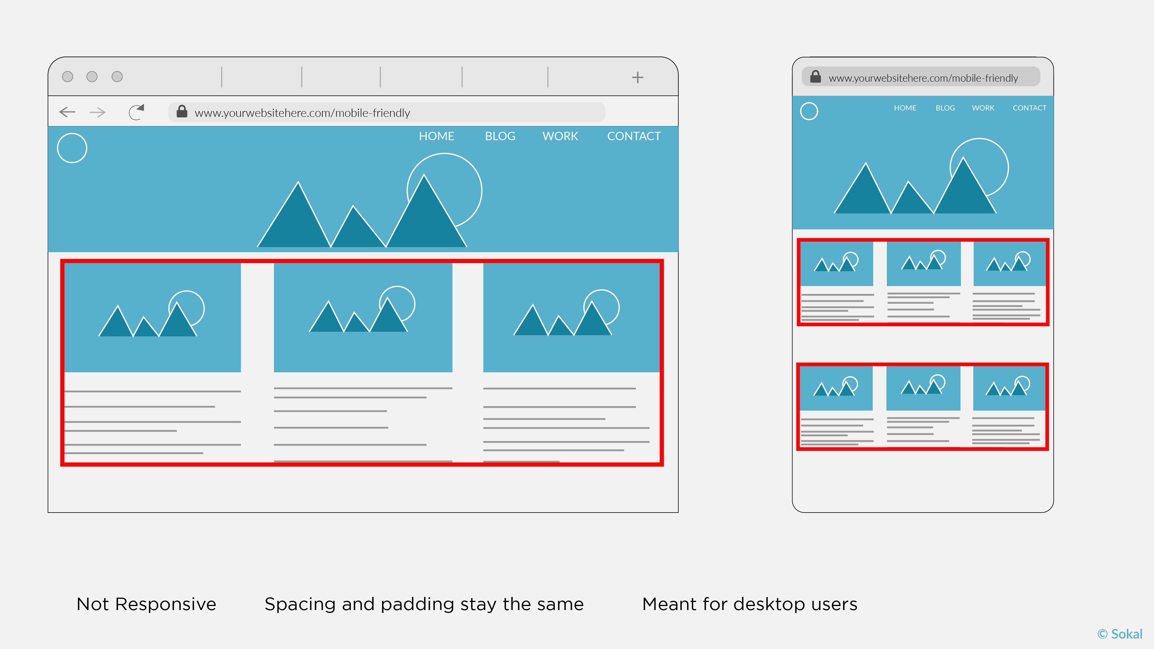
The red outline highlights the 3-column scenario mentioned earlier. Typically, mobile-friendly designs have smaller image sizing to agree with all platform screen sizes, and the navigation bars remain static with the links showing across the top of the header. The mobile-friendly website is usually the design associated with negative connotation. While we want to be careful about calling a design “bad,” it is true that the mobile-friendly website will have complications for users who have a hard time reading smaller type and navigating on a smaller screen.
What Is A Responsive Website Design?
A responsive website design will change format once it is viewed on a different device. Where the mobile-friendly site keeps its 3 column format, a responsive site changes into a single column, hiding unnecessary images and information to display the most vital content. Tungsten provides a good definition of responsive web design:
A responsive website is one that responds (or changes) based on the needs of the users and the device they're viewing it on.
Check out the image below to see how the 3 column format on the desktop version changes to a single line on the mobile display.
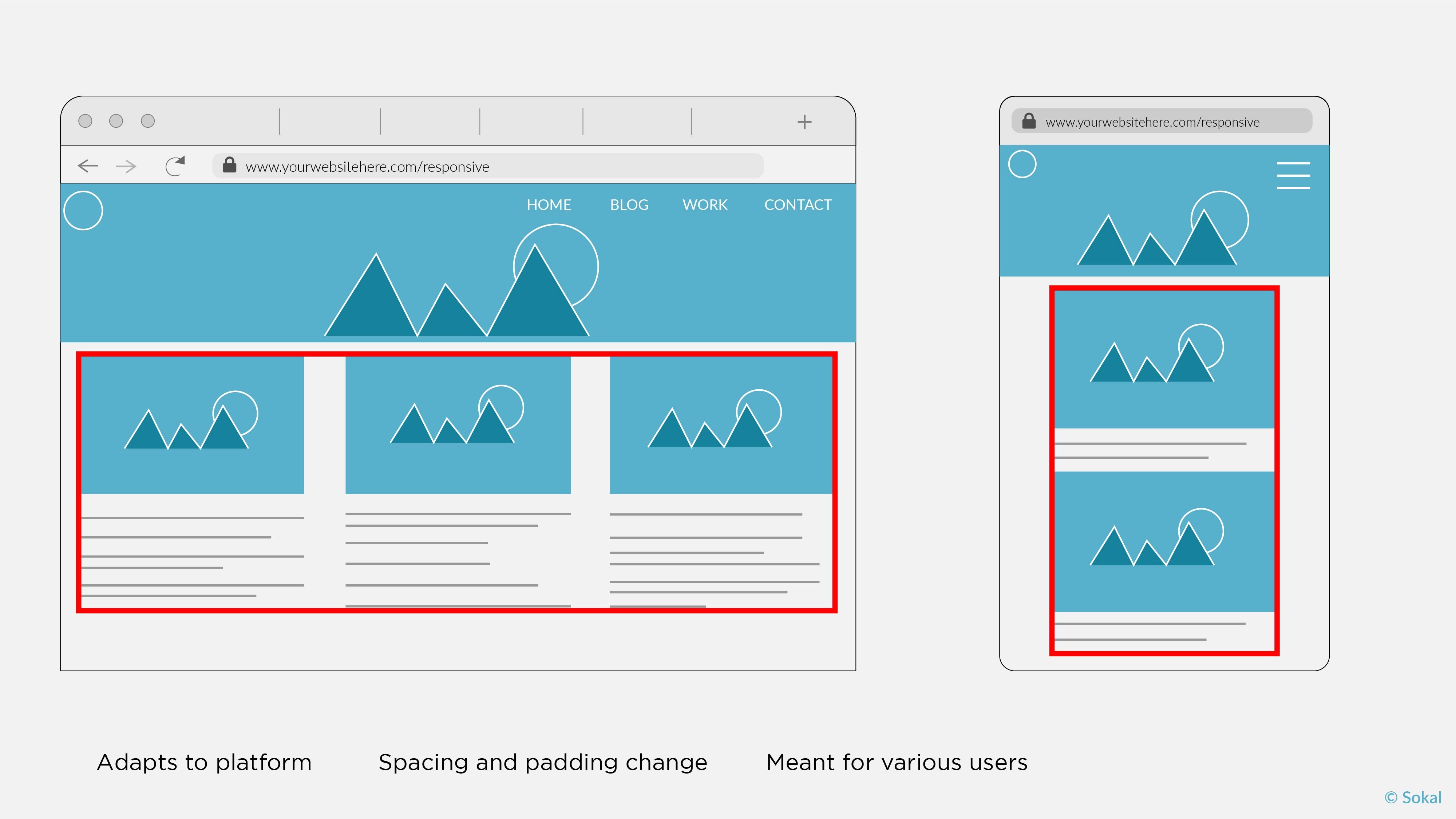
As you can tell from the image, responsive websites have dynamic content that changes with the platform, and it will automatically correct various design features like padding and spacing amongst the different platforms. The navigation bar will typically become what is known as a “hamburger” or something that resembles lines on the far left or right side of the screen. It is important to have the navigation optimized for a mobile view so that visitors can clearly see and choose which page they would like to visit.
Why Is There So Much Confusion On These Two Designs?
The Torspark blog probably says it best,
All mobile-optimized websites are mobile-friendly, but not all mobile-friendly websites are mobile-optimized.
The subject of mobile-optimization is the key difference between responsive and mobile-friendly sites. While having a non-responsive, mobile-friendly website is fine by Google’s crawling standards, it may not suit the standards of the people coming to view your site.
A text size that looks decent on a desktop or laptop may not be easy to read after it shrinks down to fit on a phone screen. This is where responsive sites excel over mobile-friendly sites. Responsive sites that are mobile-optimized reformat themselves to provide good UX and UI for the user on any device of their choosing.
If you want to test this principle, our Sokal website was designed as a responsive site. If you are viewing this blog on desktop, try viewing our homepage on your phone or table to see the differences between the layouts. You can also reduce the size of your browser screen and the website will reformat to fit that size, condensing your content and images to fit on your screen.
How Do I Decide Which Format Is Best For My Website?
All companies have different needs when it comes to web design, especially when deciding whether an E-commerce feature is needed. Torspark provides 3 helpful questions to ask when deciding on the format of your site:
- What is the purpose of your website?
- What do you want your website to do for your visitors?
- What devices are you expecting your visitors to use?
Additionally, Google’s mobile-first indexing update is important to keep in mind. Back in July 2018, Google announced that their web indexing function would change from the desktop version of a website to the mobile version of a site. Previously, Google used the desktop version to crawl and index the information necessary for overall site rank, but the mobile-first update means that the mobile version of your site will become the source for indexing instead.
If you already have a responsive and mobile-optimized website, not much will change for you or your company. However, websites that are not using a mobile operating system will need a lot more attention to make sure metadata, alt tags, images, and other vital information matches what is found on the desktop version.
Things To Remember:
Just because a website is mobile-friendly does not mean that it has been optimized for the maximum mobile capability. What might look good on a laptop will not always transfer over to a mobile phone. Think about what you want your users to accomplish, and then think about the method they will use to visit your site.
Most likely, people are seeking a quick and easy way to find out what they need, so using their mobile device will be easier than getting out their laptop or finding a desktop to use. Sokal offers fully responsive websites that display content seamlessly across all platforms. If you are considering which kind of site is best for you, we would be happy to assist you in finding a solution that works for your company.
To see an extensive breakdown of the differences between mobile-friendly and responsive websites, head over to the Tungsten Blog mentioned earlier. You can also check to see if your site is mobile-friendly/responsive using Google's test tool.
Other helpful sources: Google Webmaster Blog; Torspark's Google Post; and as always, Sokal can always help you get where you want to be.
